UX Design
As a user of many applications for creating all sorts of media, I have run into a litany of software in various stages of attempting to raise the dark beast of Bad UX Design. One might think that would be what lead me to want to create good UX designs, but that wasn’t it. I wanted to focus on creating good UX far before I even knew that it was called UX Design. I have always wanted to be part of a team creating amazing tools that just seemed to work.
Getting something to “just work” is amazingly difficult and a lot of work in its own rite.
Below are some screen shots of some of that hard work in various stages.
Internal Application Flow Chart

Flow charts serve various purposes at various points. In this instance, I was working at [REDACTED] which had a huge array of internal tools that seemed to all work together in various fashions. Before I could dive in and create a new tool or polish an existing tool, it was necessary to understand what I was dealing with. This flow chart was created with a curious mix of Omnigraffle & Visio (my first time using either) with some Photoshop & Fireworks added in to spruce it up.
This flow chart shows who owns what tool, what backend they use, what scripting language it is based on, how handoffs are made between tools (or end users), what processes aren’t tools at all (but, instead are just done by hand), what outside services they use, and the list goes on.
In addition to this very large flow chart (that has been shrunken down and had its details blurred for privacy), multiple documents accompanied it.
A lot of UX design has happened in documents like this and also in very well laid out bug reports. I am not including any bug reports in this portfolio, of course, but much of my experience at fast moving startups has had a large portion of UX flows spelled out in such reports.
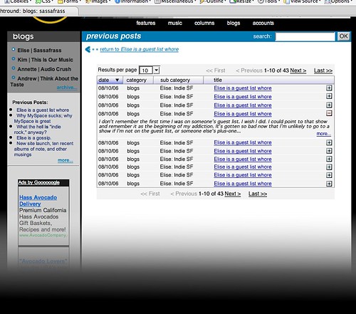
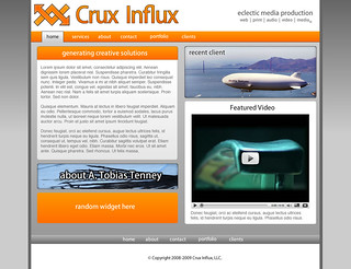
Web Based Internal Tools
At Digital Chocolate, a mobile game developer and publisher, I was tasked with creating an internal framework for all of their existing tools to live within. I designed the tree structure to have three vertically stacked layers. I did this so that once the embedded tool was inserted it would only have a few pixels on the right and left altering its width while the top would just be moved down.
Since I was not tasked with the actual integration of the tools, I tried to make this as low impact as possible.
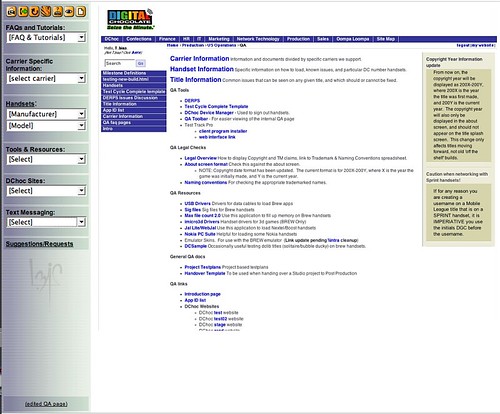
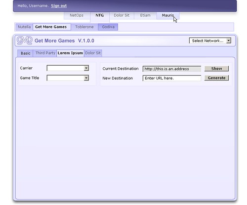
In addition to bringing multiple in house tools under one roof, I happened to make a special frame based tool for the QA department.
I made this tool during any downtime I could find. On the right, you can see the tools that QA had at their disposal; mostly links to libraries. Everything on the right can be easily accessed with the few tools on the left. For example, they could select a manufacturer and have a list, originally with every handset, culled down to just those handsets from that manufacturer. A seemingly small thing, but prior to this, one had to skim through literally hundreds of models, sorted numerically by serial number, to find the one they were working on.
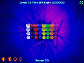
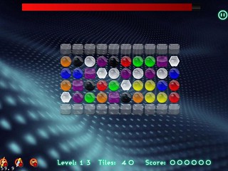
iPad Puzzle Game
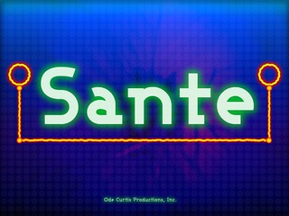

Sante is a game based off of an ancient game using Mahjong pieces for a kind of solo Mahjong (note: this isn’t the same as the normal rendition of “Mahjong Solitaire”) that I and a small team adapted for the iPad. It turned out that I was the only one with game design experience (when I was a very young teenager, one of my older friends who is a game designer would send me games from Japan because I wanted to be a game designer when I grew up). I lead a few discussions about game theory and addictive gaming behavior (turns out I learned a lot while researching dopamine for a piece I wrote on my blog that got posted to BoingBoing some time ago).
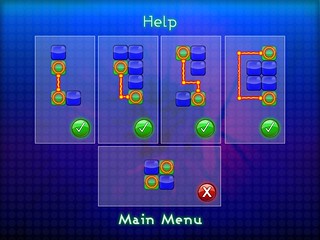
One of the more interesting UX challenges was to try and explain the rules of the game. My first thought was that users would simply figure it out, but that would leave too many unanswered questions. In the end, I decided that for small devices and the experience we were trying to create we would be best served by a help screen with absolutely no text.
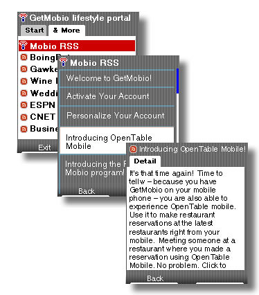
Mobio Web Interface For Mobile App
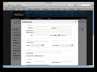
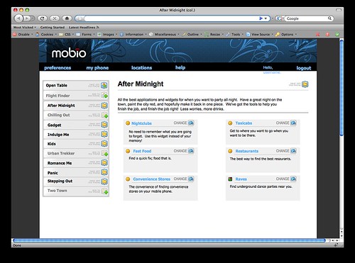
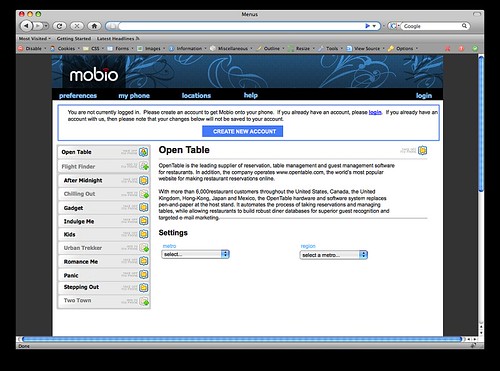
The above mock-ups were generated using an old application that let you create static HTML pages which you clicked on to view another static page. You could simulate things like greying out the page behind a pop up window by placing an image of alternating black lines and transparent lines as a GIF (a hack I created as this was before JavaScript libraries made such things unified interaction assets).
These pages show the web application that you could use to manage your mobile application. This was not the norm at the time, but I pushed for it; managing it on the handsets (pre-iPhone) was exceptionally difficult and included long loading times.
You were able to create an account that tied you back to your phone, toggle which applications were on/off with just a click, and customize each application depending on what each application offered. You can see “After Midnight”, a nightlife app, and “Open Table” the reservation service. Although these mock-ups don’t show it (merely because this is an early version), in the end, every application and sub-app had their own web icons that related back to the mobile app’s icons.
Below are some screen shots of the RSS feed app as it would be seen on the ever popular Razr handset. Oh, how times have changed…for the better!
Enterprise Email, Calendar, etc.
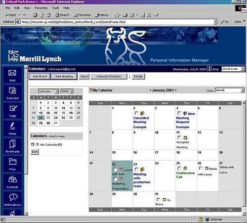
Critical Path started by hosting web mail. When the boom really took off, so did Critical Path [CP], one of the poster children of the internet boom. In a feeding frenzy, CP gulped up 11 companies. One of those was Remarq (formally, and in my opinion more memorably, known as Supernews), a company that specialized in collecting and then hosting Usenet on the web. I had the very odd experience of interviewing at Remarq, but being hired by Critical Path.
After automating a branding tool to draw every image asset needed for branding Remarq’s enterprise product by teaching myself to automate Fireworks (a new application to me at the time) using JavaScript (a new language for me at the time) all in three months, I moved on to the Interaction Design Group at Critical Path HQ. Our goal was to take all 11 companies and create one wonderful user interface.
Tipping Panel For Blogs & Similar Sites

Above is my original UX mockup. The goal was to offer a way for a blogger, for example, to place a very small button requesting tips for their post that, when clicked, a pop up a window with a tipping panel appeared allowing the reader to tip any amount they wished. [I can’t get into too many specifics other than that.] I felt my original design was slim, direct, to the point, and, as I later mention, with a built in rating system.

After the startup had spent many rounds of iterations, other features were added and needed to be placed on the tipping panel, including a rating system. I always felt that the tips were in of themselves a form of rating, but the client needed to have separate ratings, even with my notes in mind, and so I delivered.
Survival Research Laboratories Website Redesign
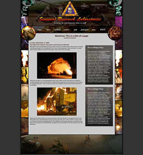
The SRL website had not been updated in well over a decade, until I got a phone call from a dear friend who volunteers with them. I spent a lot of time ensuring that my design was inline with Mark Pauline’s (the founder) aesthetics. I reviewed ever poster, flier, handbill and other designs that had been produced for SRL over the years (30+) for inspiration as I knew Mark Pauline to be very picky about outsourcing artwork.
This picture is what I shipped along with most of the images chopped up in various ways to make the implementation easier.
The new design was implemented by k0re which is now live.
Animated Game Sprite Demos


In 2D game design, coders usually use things called “sprites” for things like characters, enemies, etc. Anything that needs to move around and interact with the player’s character, including the player’s character. I was called upon by a friend to come up with completely new ideas for what his spaceship shooter should look like; there were no boundaries or limits to where I could go with this.
I came up with a weird mix of a sentinel spaceship and a cell with a moving nucleus. I made various animations to show momentum (top) and a potential power-up animation (bottom) of the “nucleus” splitting. The interesting thing is that making animated GIFs (which I put at the bottom of my portfolio since they can get a bit annoying to look at) makes a lot of sense for 2D video games. When you want to make an animated sprite you need to have every frame of the animation prepared, which you inherently do by creating the animated GIF.
A few more things to look at…
Below are some designs I wanted to include, but didn’t feel that they deserved much of an explanation. Clicking on them should bring you to their full Flickr page where you should also be able to view them at full resolution. Please contact me if you run into any problems with this, or any part of my portfolio: me@TobiasTenney.com