Photo Touchup
As a photographer I have spent many years touching up photos as well as in my day to day work as a graphic designer. Here are a few examples with “before” and “after” images. The “before” images are taken directly off of my camera and are completely unaltered (except for sizing and my © watermark).
Note that you can click on the images to view them at high resolution.
If you would like to get a hold of me, please contact me via email here: me@TobiasTenney.com
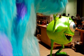
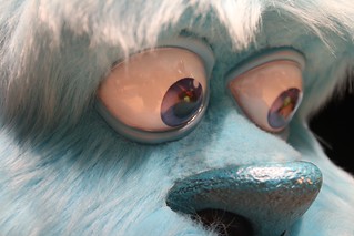
Item #1
Before
After
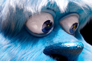
This is a life size model of the character “Sulley” from the PIXAR film, “Monsters”. Right off the bat I had to move the white balance towards the cooler end. I also decided to correct the blue color to be more vibrant as the display had clearly seen too much sunshine and deteriorated slightly over time. Even with the color correction, there was some color in the whites of the eyes; increasing the saturation also increased that color. I grabbed just the whites of the eyes, knocked out all color/saturation, and brightened them up to make them look much more stark white.
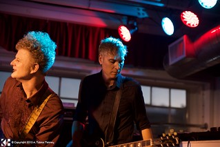
Item #2
Before
After
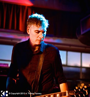
This is a photo I took of the band “Roadside Memorial” performing live at the DNA Lounge in San Francisco. When I saw the original image I noticed that I had happened to capture a good moment of the guitarist focused on his work. First I had to crop the image to exclude the bassist on the left and get rid of as much on the right hand side as possible without getting rid of the guitarist’s guitar. Even after doing this, I still had two very bright lights above his head that were not only a distraction, but they also pulled the eye away from the guitarist and completely threw off the balance of the piece. I decided to remove both lights in Photoshop which not only solved the aforementioned issues, but also provided some much needed negative space. I also darkened the vent and windows in the background, lightened his face, added some local sharpening to his hair to help bring his head forth from the background, and generally added more contrast to help make him pop from the virtual canvas.
Item #3
Before
After
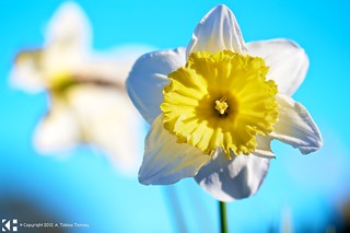
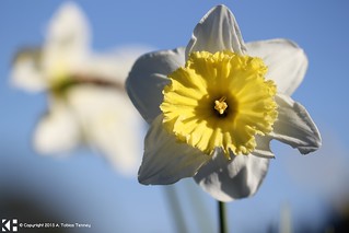
This is a photograph I took of a pair of flowers dancing in the wind along the median in the street. The original image, color wise, was very bland. I first attempted to fix this merely by increasing the saturation of the piece as a whole, but I ran into problems with the white petals no longer remaining white. So I had to approach each color on their own. First I focused on the blue by tuning the hue, brightening it, and increasing the saturation, but making sure to only do this to the sky. Then on to the yellow–bumping up the saturation just a bit as well as the brightness while leaving the hue where it stood. I made sure to augment the yellow that had passed through onto the petals as well as in the background. I also made sure that the stem was nice and vibrant green. The last was to brighten the petals while making sure they both kept their white appearance and did not create a halo effect; you can see that I made a point to brighten the two left petals of the foreground flower as they were not correctly lit.
Item #4
Before
After
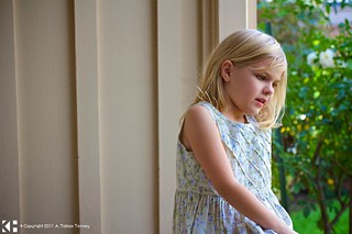
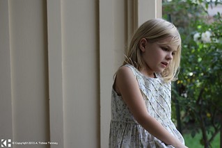
This is a photograph I took of my niece taking a break from her homework. First I brightened her up and made sure that she was the center of the piece. I added more color to both her and her dress while maintaining a proper skin tone. I also noticed that the print on her dress had small blue flowers, so I grabbed that color and amped it up by increasing both the saturation and brightness of only that color and only on her dress. Next came the garden to the right; I tuned the hue of the green to make it look more lush and increased the saturation as well as the brightness just a bit. The background directly behind her was only minority adjusted–I made sure that it had a bit more color so it would not look out of place and only made it bright enough to look natural as I wanted to make sure it remained as a background/negative space.
Item #5
Before
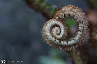
After
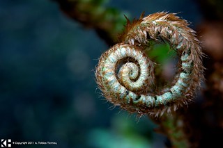
This is a photograph of a fern, more accurately the fiddlehead of a fern, I took in Seattle just as it was sprouting. My first task was to bring out the colors in the fern–the battle between the reds in the fur and the greens of the curled up leaves didn’t jump out in the original photograph as much as they seemed to in real life. I had to be very selective in the colors I chose to alter. The colors effected were very narrow. I turned the reds in the fur up as I turned up the greens in the leaves making sure that they both kept to themselves without bleeding over into each other. After that, I darkened the background significantly, added some local contrast to the foreground, brightened up the fiddlehead and added just a touch of a vignette to the entire photograph to enhance the darkening of the background.
Item #6
Before
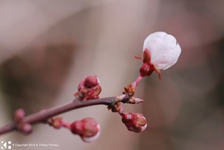
After

This is a macro photograph, with three flashes, of a freshly budding cherry plum blossom. I noticed immediately that there was not enough difference between the foreground and background to make the subject pop to life; it was a wash of the same color. First I had to darken and desaturate the background without augmenting the foreground. Once I had completed that I moved on to enhancing the blossoms. I bumped up the saturation as high as I could while still keeping the plant within the realm of reality and then took special care to deepen the natural reds in the soon-to-be leaves. The hardest part was to avoid a halo effect where the foreground meets the background.
Item #7
Before
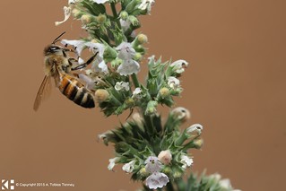
After
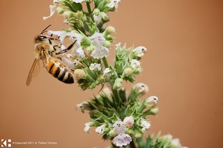
This is a macro photograph of a bee feeding on catnip blossoms, again using at least three flashes. I include this image as an example of restraint. One of the hardest things to learn is when to stop. Sometimes all you need to do are global touchups to the color, saturation, brightness, and contrast to get the most from the image. Of course, I also added a subtle vignette to it, but other than that, I did very little. If I had done too much, then this image may not be one of my favorites.
Item #8
Before
After
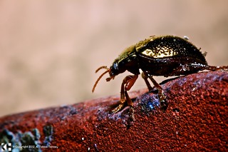
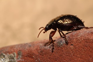
This is a macro photograph of a ~1cm, at most, long beetle. I spent a long time on this photograph. First I had to alter the temperature as it was far too warm (you can tell by the “white” reflection on the beetle’s shell). I then reduced the saturation of the background while increasing it on the red brick. I also added a lot of local sharpness and contrast to the brick to bring out the detail of the rough sides. I then brightened the eye of the beetle as I noticed I had managed to capture the detail of each of the minute eyes that make up the single eye. I also added local sharpness to make these white dots pop out just a tad more. The depth of field was probably a few millimeters which made editing this quite difficult.
Item #9
Before
After
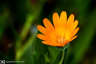
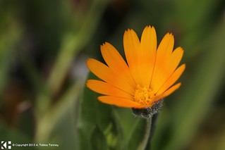
This is a macro photograph of a very small (~2cm) field marigold. I changed the temperature of the colors, but only of the background greens leaving the orange petals as they are. I then darkened the background, brightened the petals and added a good amount of saturation to bring the colors out. Underneath the flower, I sharpened the bulb to help bring the spots of water forward. Lastly, I put a slight vignette on the photo to help recess the background.
Item #10
Before
After
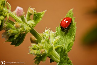
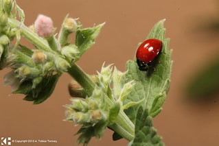
This is a photograph of a ladybug atop a catnip leaf. I did almost the same processing to this photo as I did to Item #7, but for one exception. I altered the ladybug separately from the rest of the image. If you look closely, the head of the beetle is black and white; to make this more pronounced I actually removed all color from its head and upped the contrast to make sure that the whites are white and the blacks are black. I also brightened the red shell of the beetle to make sure the focus of the piece is the ladybug.
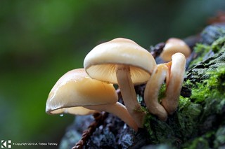
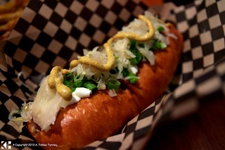
Some Additional Photos to Check Out
Here are some more photos that I have done touch up work on. If you would like to see “before” photos for any of these, please email me (me@TobiasTenney.com) and I will find it for you.